Logo | Brand Identity | Mascot Marketing Materials

About
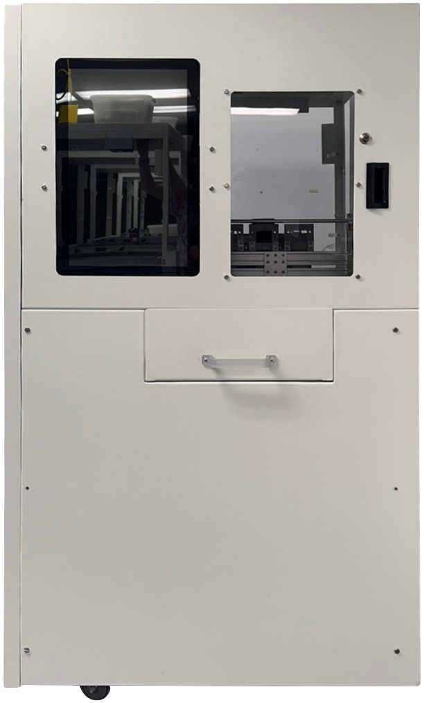
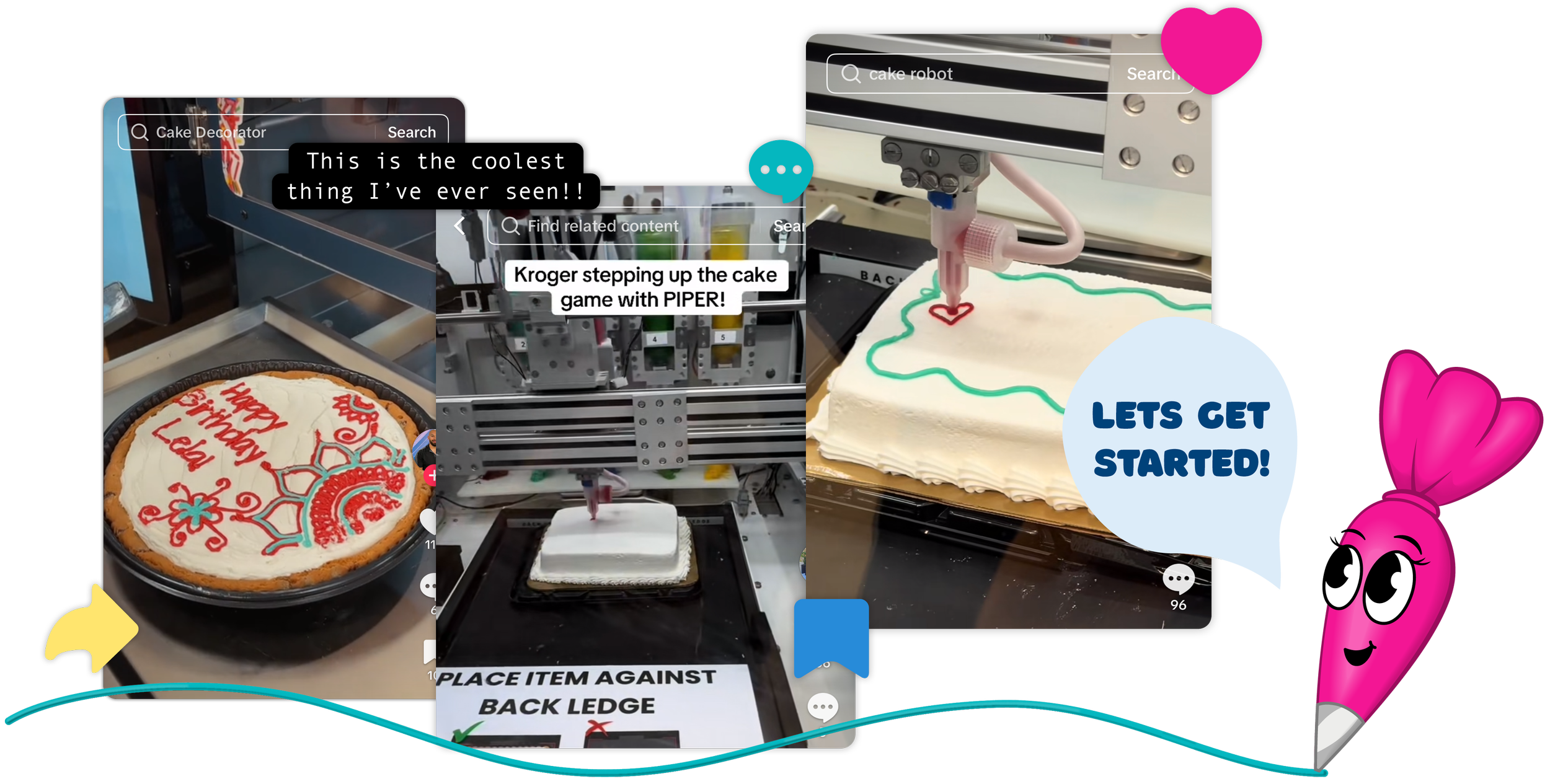
Piper is a cutting-edge cake decorating machine developed by Columbus-based automation startup BeeHex. Designed to transform the customer experience, Piper allows users to personalize cakes with custom messages and designs—right on the spot. As Kroger prepared to roll out the machines across Ohio, BeeHex recognized the importance of strong branding and marketing to support the initiative.
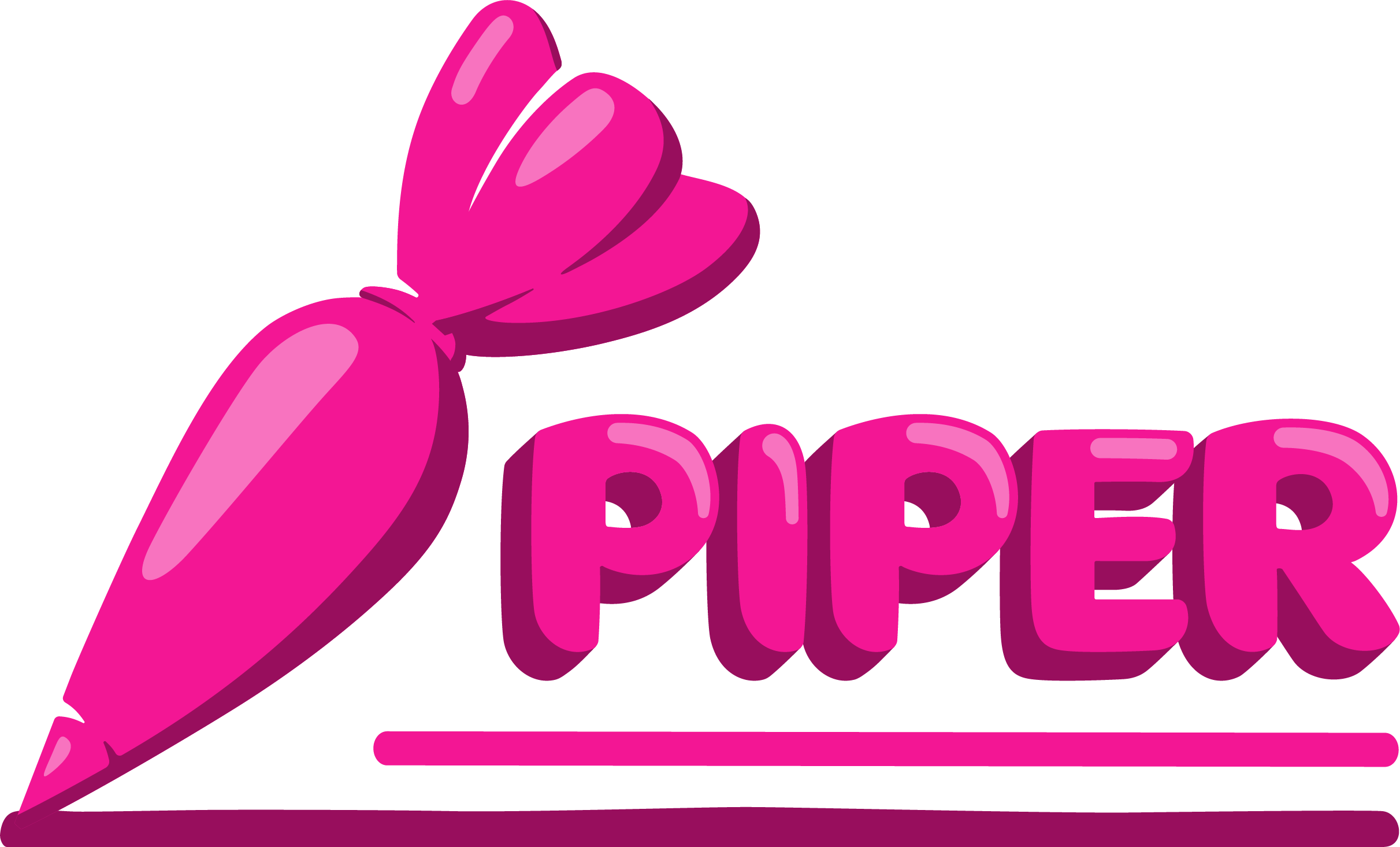
Logo
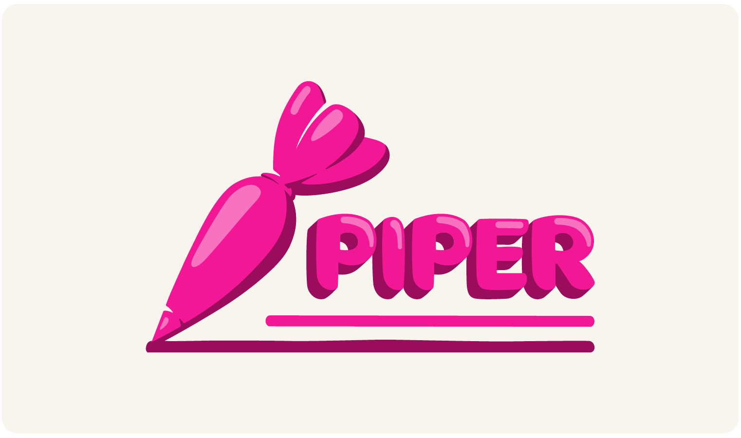
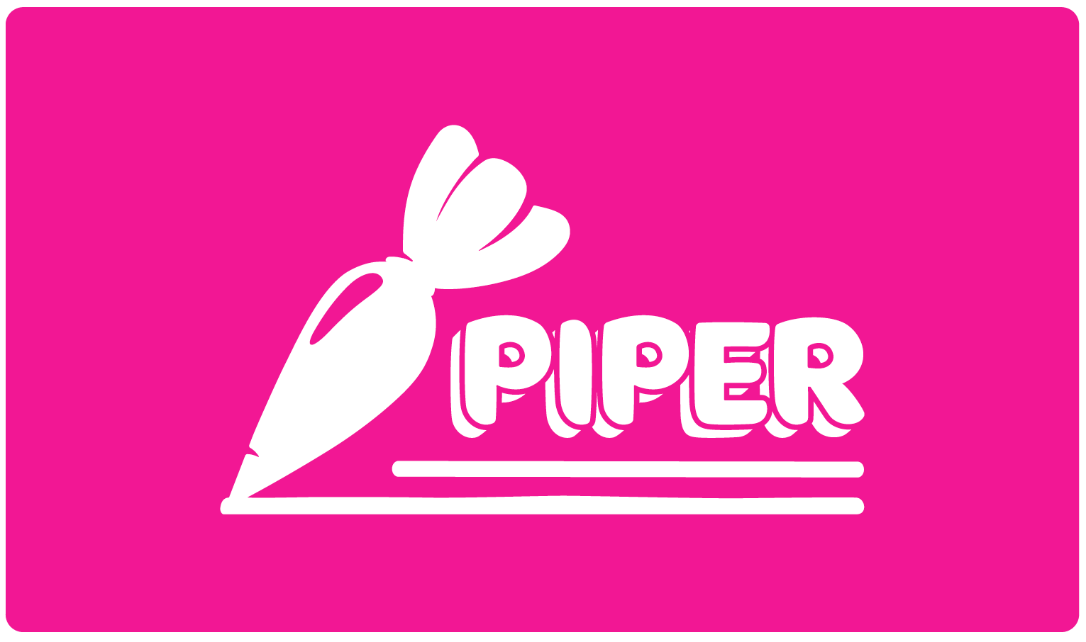
In response to the client’s vision, the Piper brand identity was built around a playful, approachable mascot paired with a bold wordmark. The vibrant neon pinks and the Borsok typeface—both specified by the client—ensure strong shelf and in-store visibility, instantly catching the eye of Kroger shoppers. Together, these elements convey Piper’s fun, friendly personality and promise a quick, easy, and delightful cake-decorating experience.


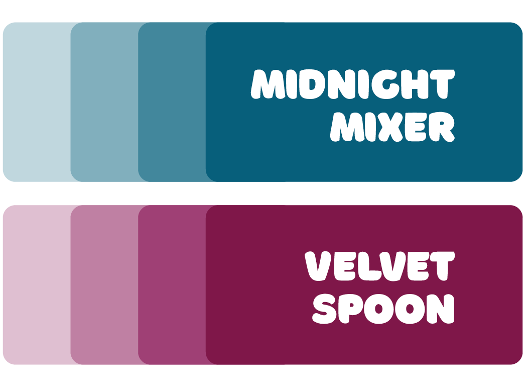
Primary Colors
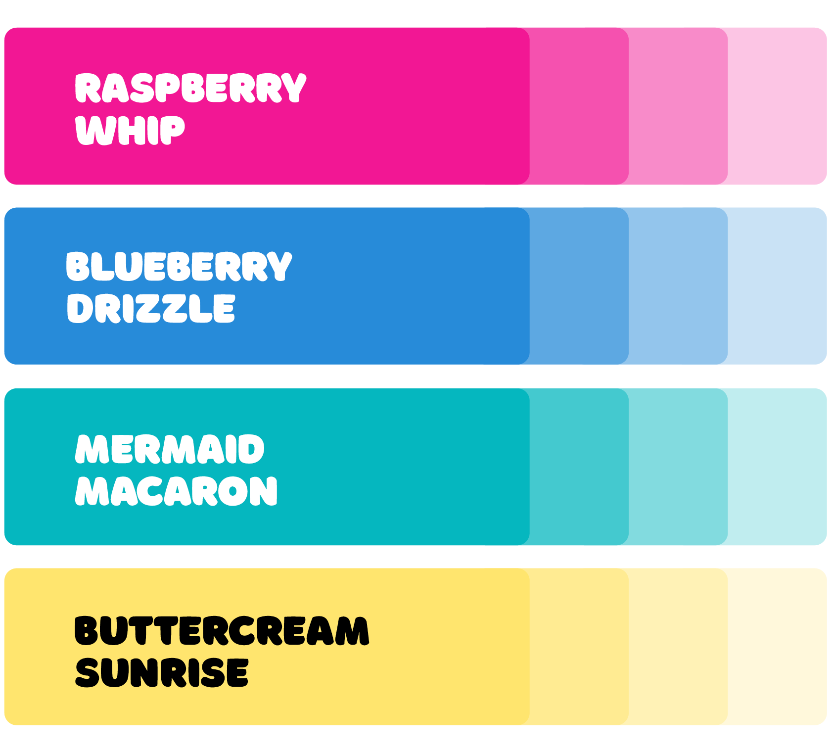
To honor the client’s initial request, Piper’s core colors are vibrant pink and shade of blue—bold, high-energy hues that reflect the brand’s playful spirit and stand out to shoppers in a busy store environment. To balance their intensity and allow these primary colors to shine, two softer, lower-contrast tones were introduced. This combination creates visual harmony while keeping Piper eye-catching and full of personality.
Secondary Colors
To complete the color system, two deeper shades were added to serve as accents. These tones provide contrast and flexibility, supporting the primary palette without overpowering it. Used sparingly, they help highlight key elements and add visual depth to Piper’s playful branding.
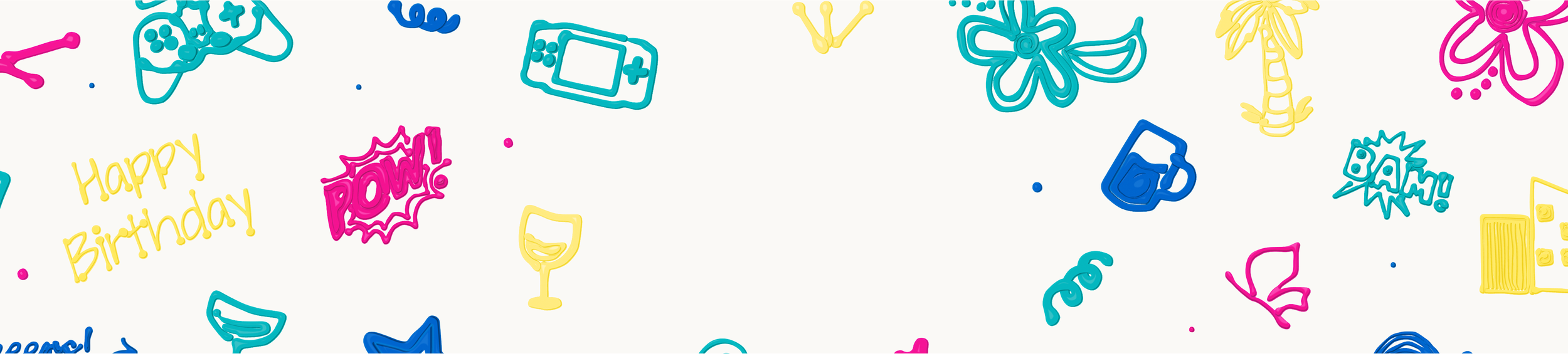
Patterns
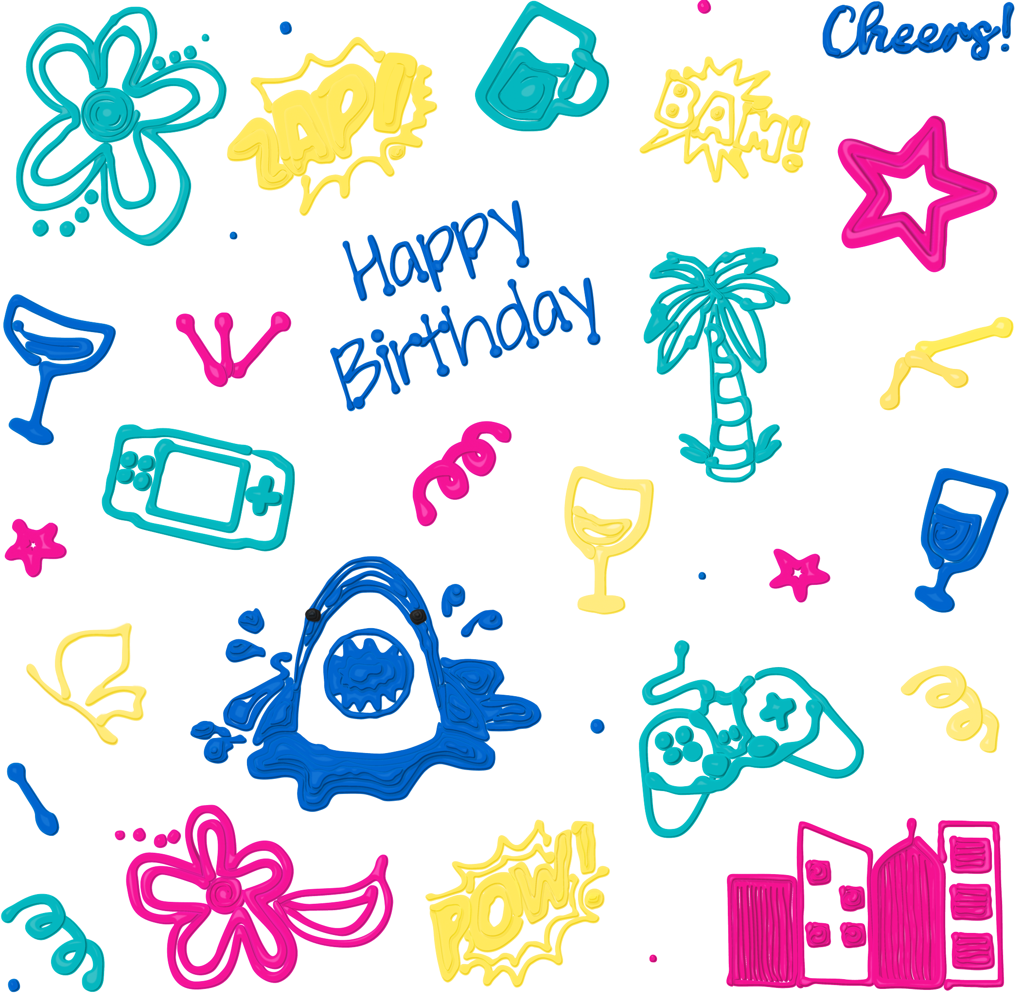
During early crowd testing at Kroger, BeeHex observed limited interaction with the machines, in part because shoppers were unsure of their purpose and perceived them as just another vending machine. To address this, the existing cake designs were transformed into playful icing illustrations. These vibrant, eye-catching graphics were applied across the machine, interface, and supporting materials, instantly communicating Piper’s purpose and inviting customers to engage.


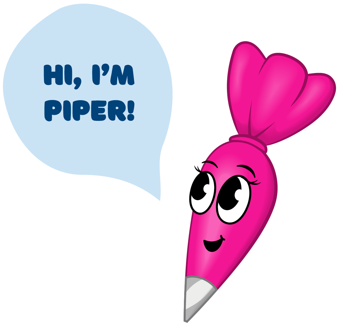
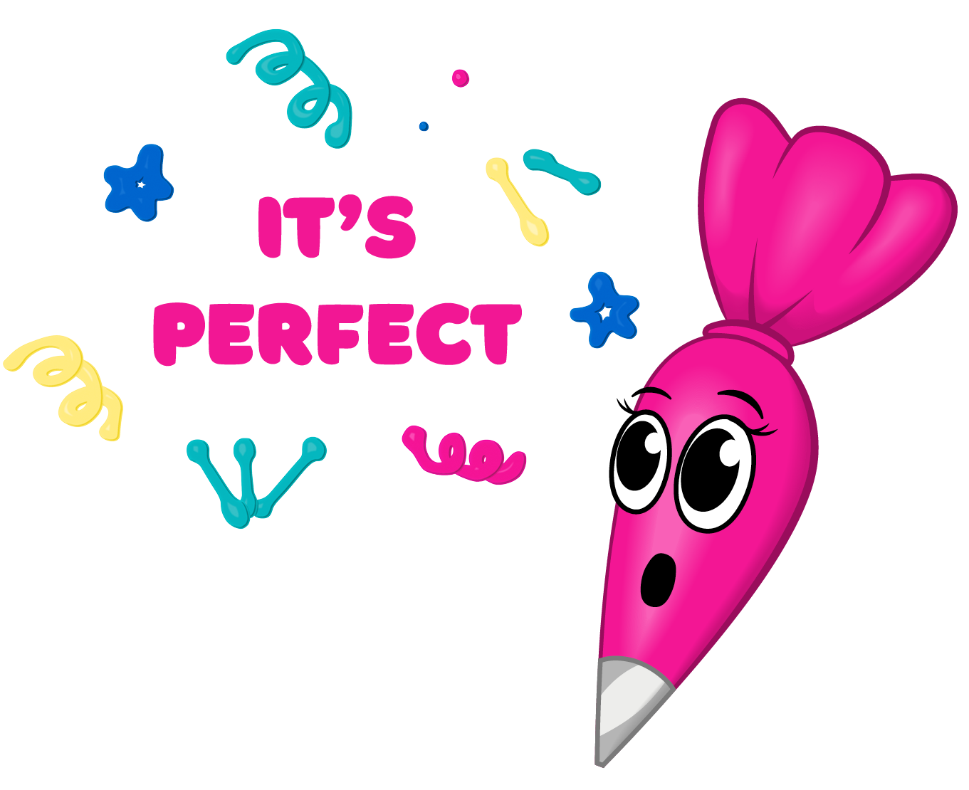
Mascot
The client requested a mascot who could guide, delight, and ease tension throughout the customer journey. Piper was born in three expressions: Piper 1, the recognizable face of the brand, sparking curiosity with playful icing strokes; Piper 2, the friendly instructor who keeps steps approachable and clear; and Piper 3, the surprised expression that lightens error pages and previews with humor. Together, she adds warmth, clarity, and charm at every touchpoint.


Sarah Mae Ceramics

LegionElite
