
Case Study
Logo | Brand Identity | Stamp | Business Card | Website
About
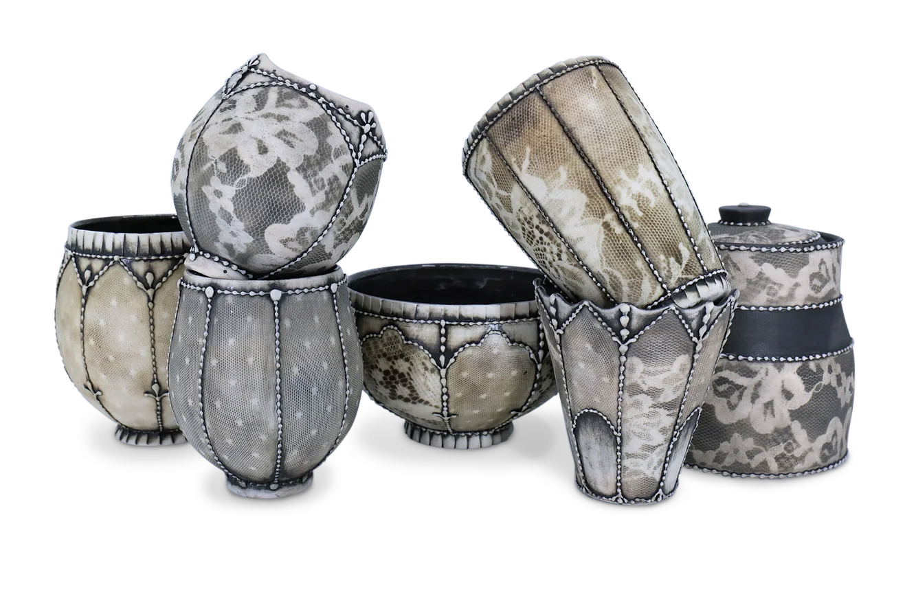
Sarah Caudill is an independent ceramicist known for incorporating textile and architectural design elements into her work. Currently completing an apprenticeship to prepare for her long-term goal of becoming a full-time seller, she has recognized the need for a brand identity as her business grows.

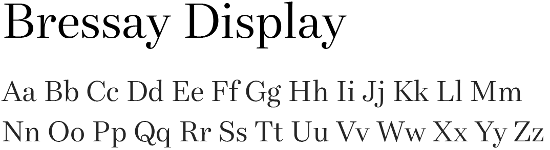
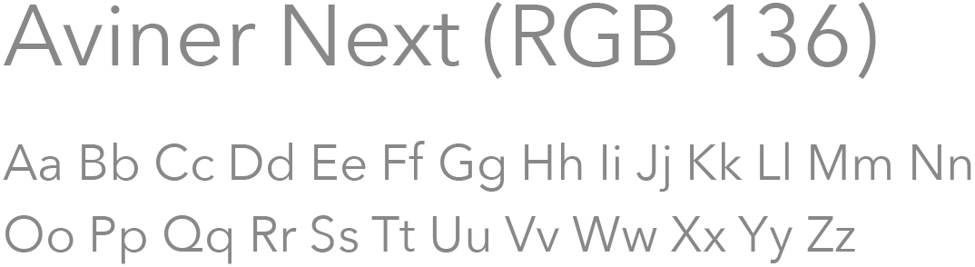
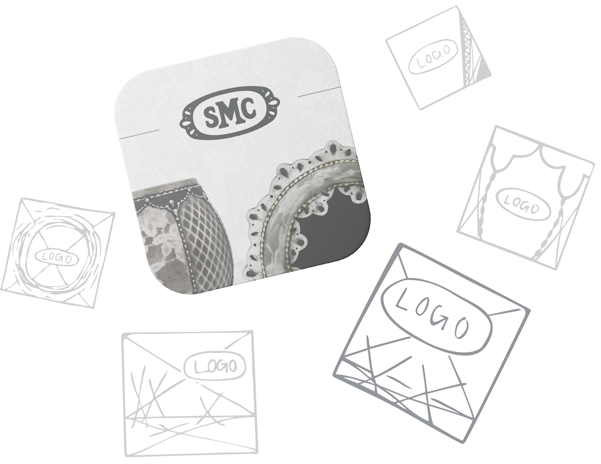
Logo
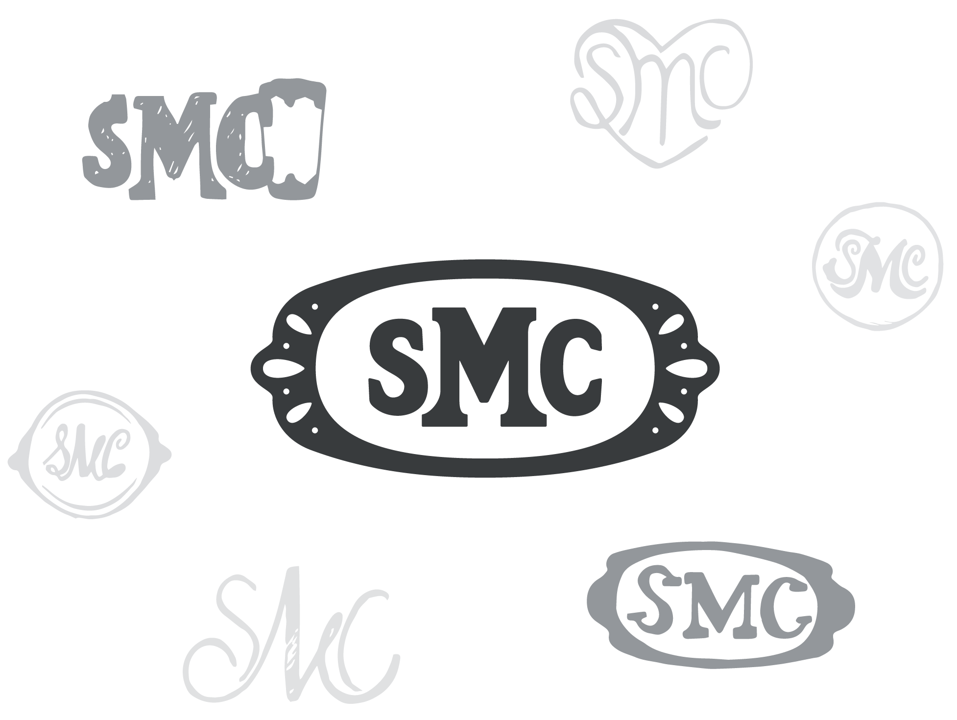
Sarah reached out with a request for a single-color logo featuring her initials, primarily for the purpose of stamping her artwork. After immersing myself in her artistic style and the fine art market, I started sketching ideas, aiming to capture the essence of her work through repetitive patterns. With rounded edges, smooth lines, and scalloped details coming together, the vision for her logo began to crystallize, ultimately merging two sketches into a cohesive and elegant design.


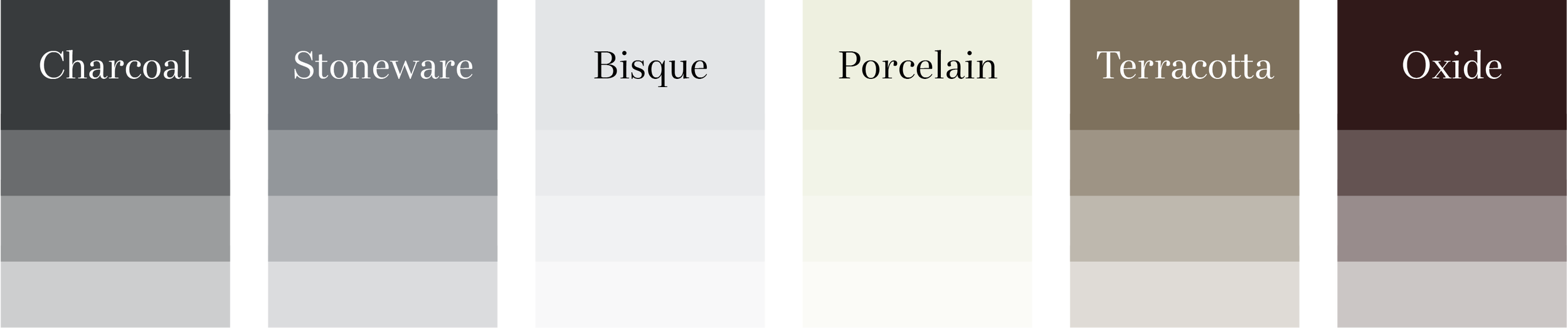
Color Palette
Sarah is renowned for her ability to capture beauty in colorless forms. The color palette chosen embodies this philosophy, showcasing a sophisticated range of gray shades and architectural earth tones. These colors reflect the timeless quality of her work, seamlessly harmonizing with her minimalist aesthetic.
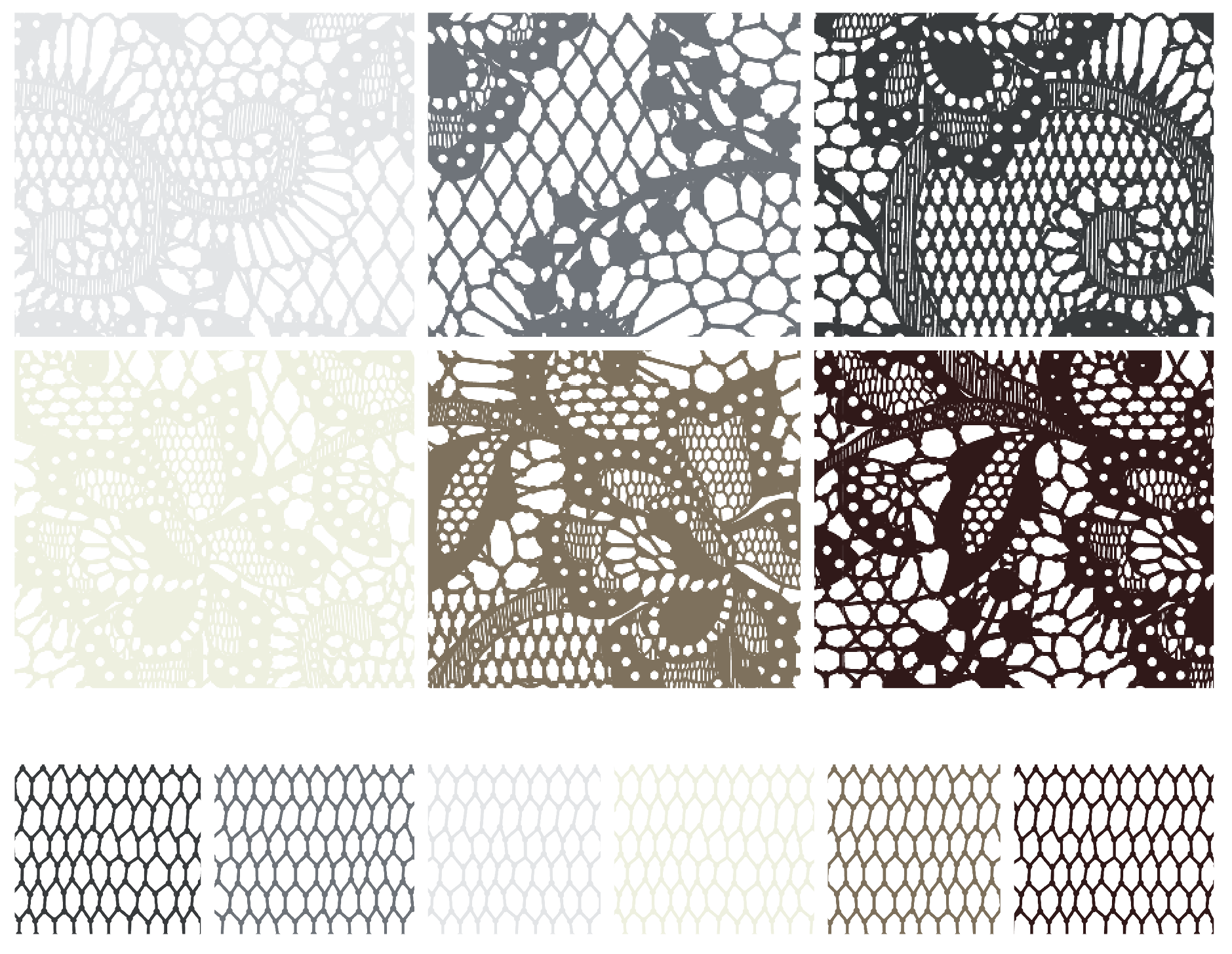
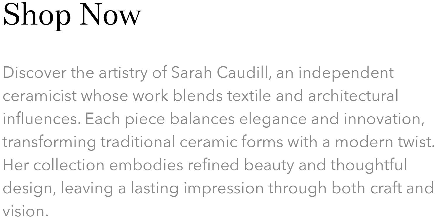
Pattern Swatches
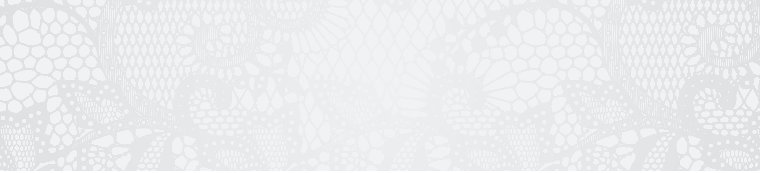
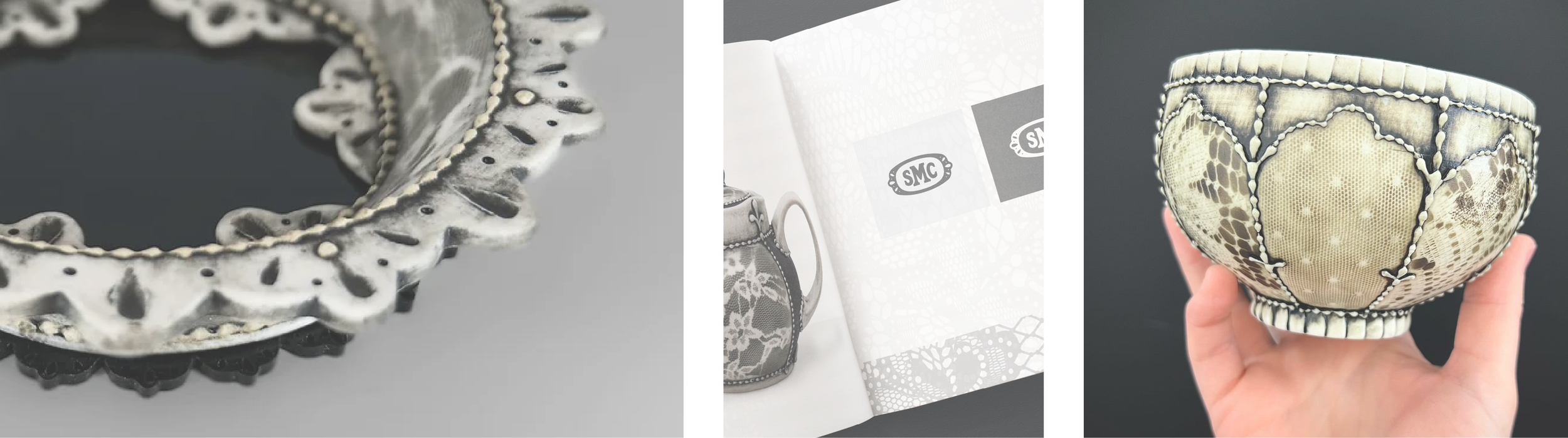
Lace weaves gently through Sarah’s visual identity, echoing the delicate impressions found in her ceramic work. Across webpages, marketing pieces, and business cards, the pattern appears as a subtle backdrop — often softened with a graceful fade toward the content. This restrained use of lace creates continuity between her craft and her brand, adding texture without overwhelming her minimalist aesthetic.
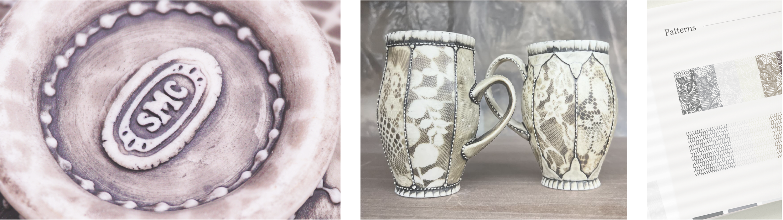
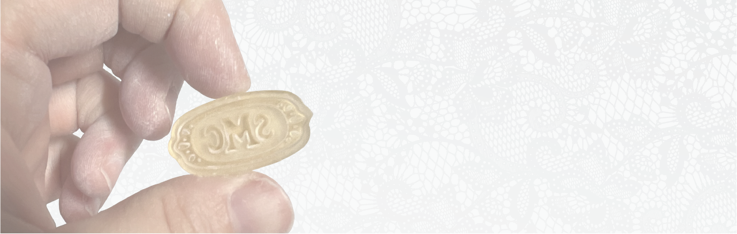

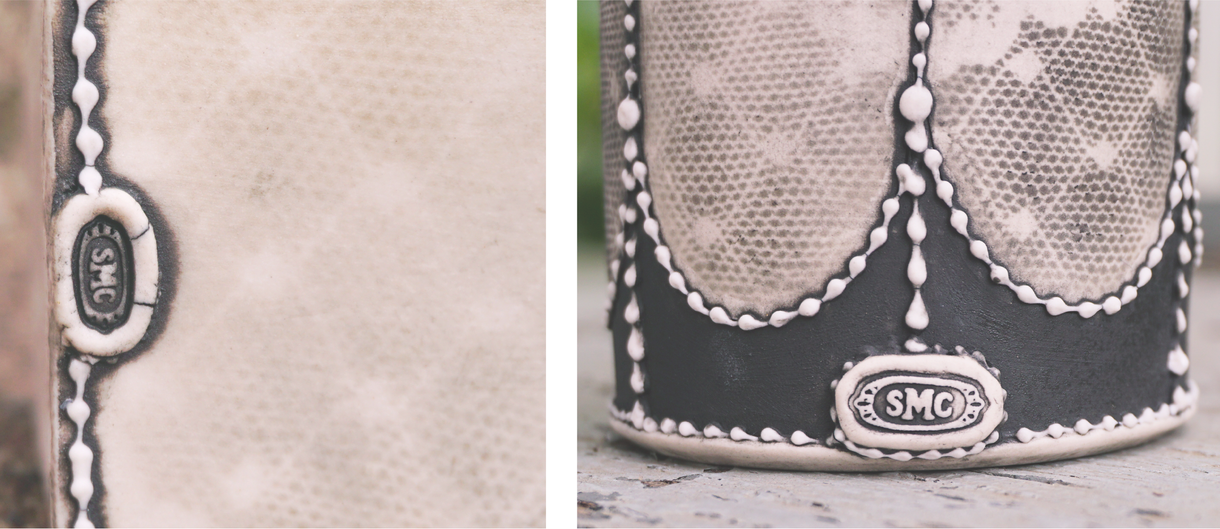
Stamp
To carry her brand into each piece, Sarah had her logo produced in multiple stamp sizes. While the clay is still wet, she presses the mark discreetly onto the underside of her work. This subtle detail creates a consistent signature across her collection, tying every piece back to her studio.


Business Card
Following the completion of the logo, the client needed business cards to enhance her brand identity. I experimented with various design concepts aimed at prominently showcasing her work, which led to the decision to explore three different options. Ultimately, she selected a card featuring an elegant, subtle lace background with two standout portfolio pieces prominently displayed in the corners.


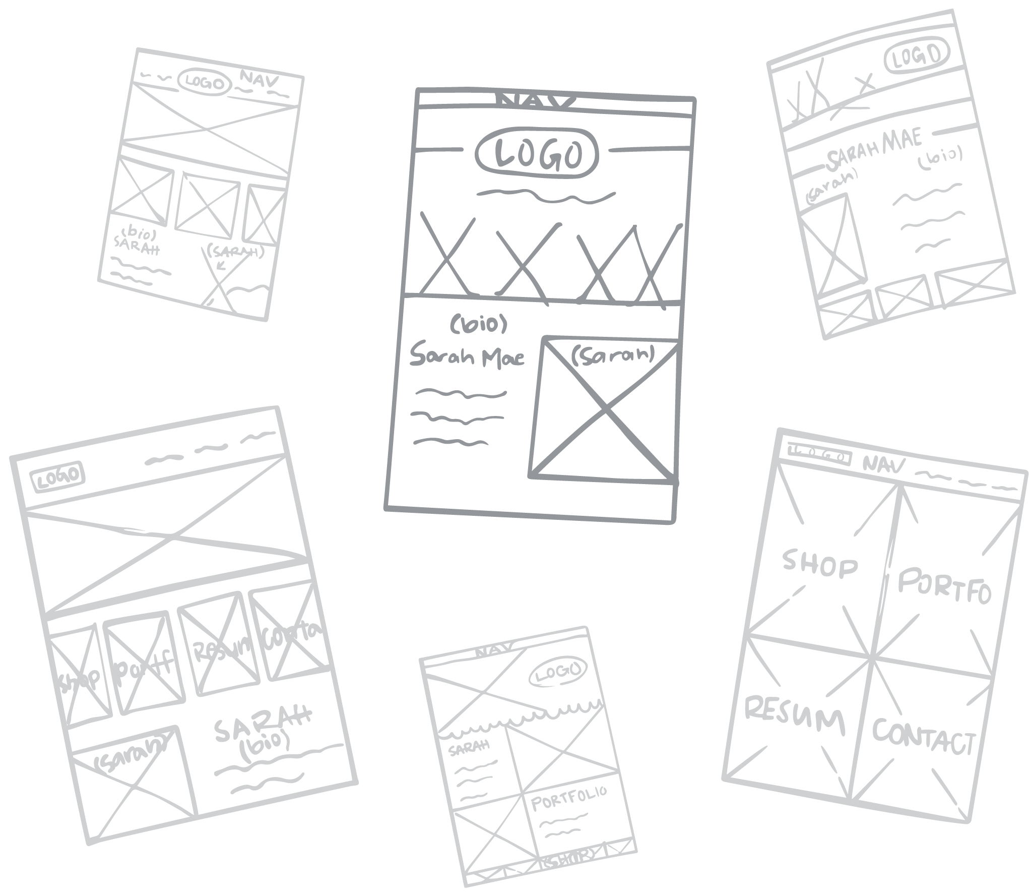
Website
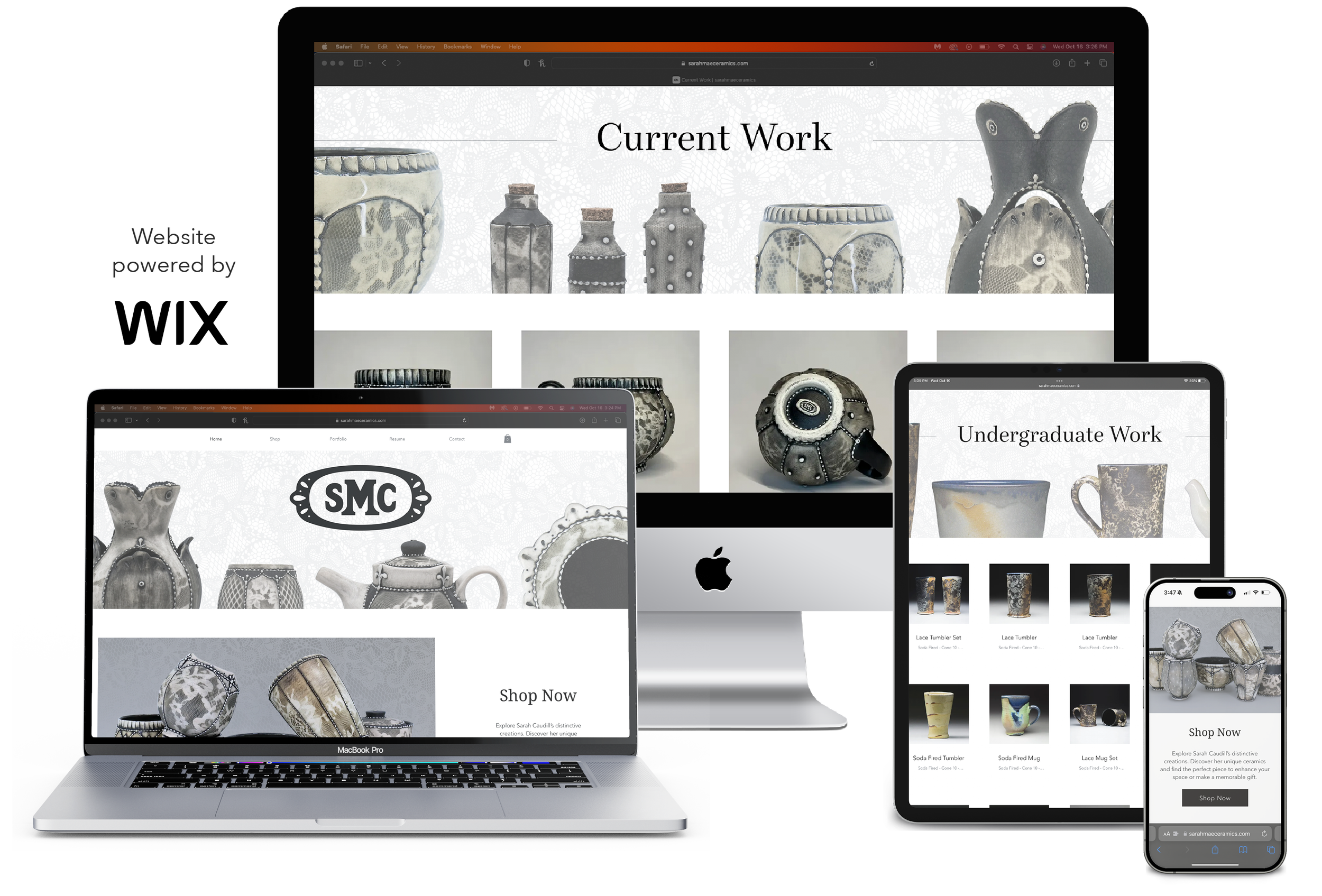
Next came the creation of SarahMaeCeramics.com. As Sarah transitioned to independent selling, the need for a polished and inviting online storefront became essential. Several design options were developed, blending established styles with innovative touches. Ultimately, Sarah chose a design that seamlessly reflected her business cards, showcasing her elegant pieces within a soft, minimalist aesthetic.
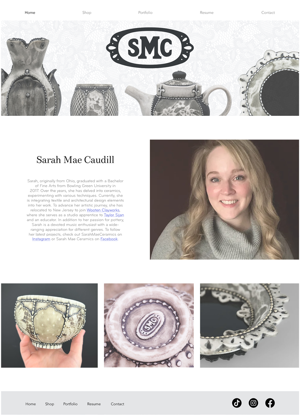
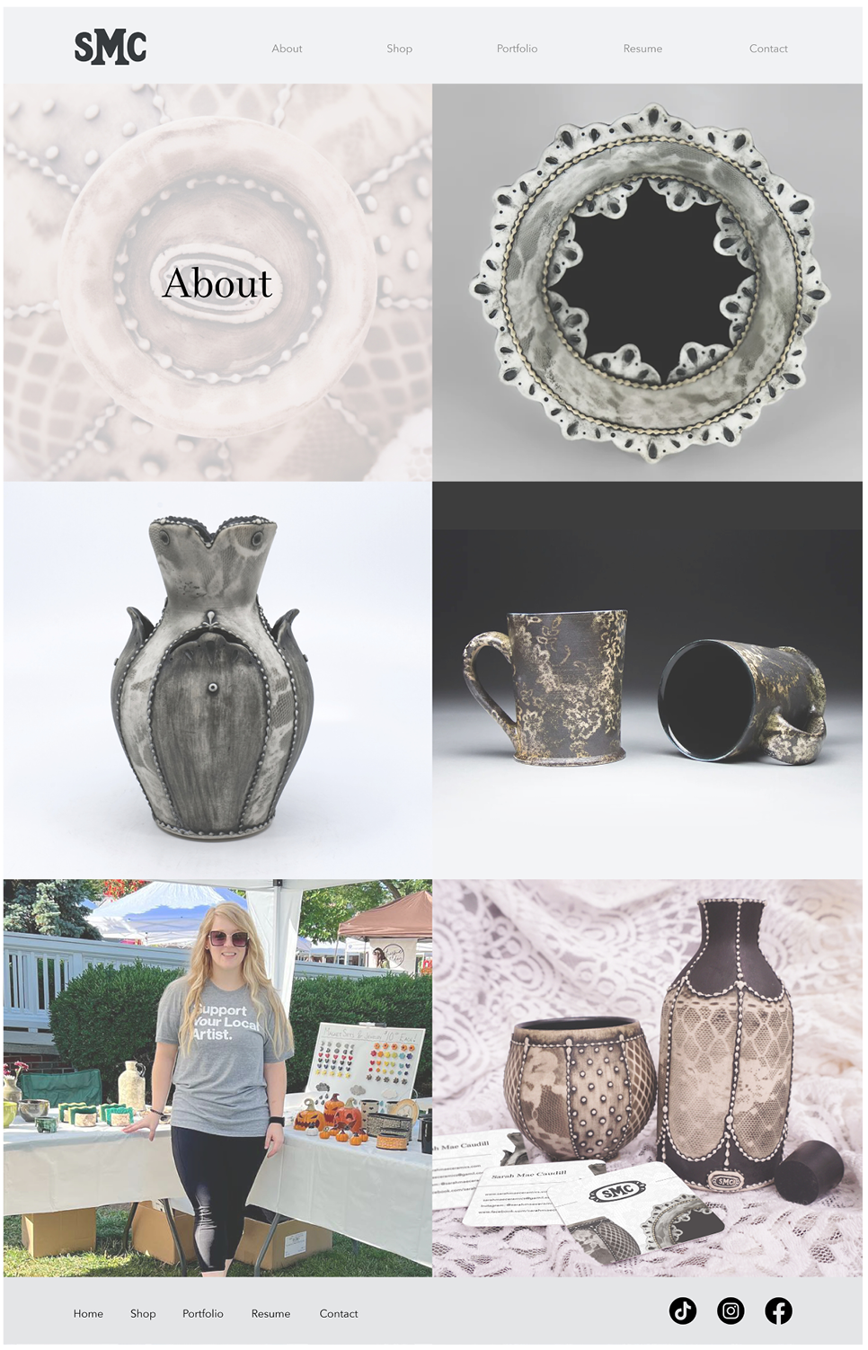
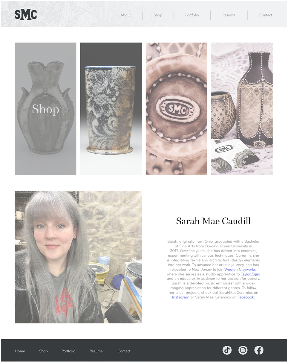
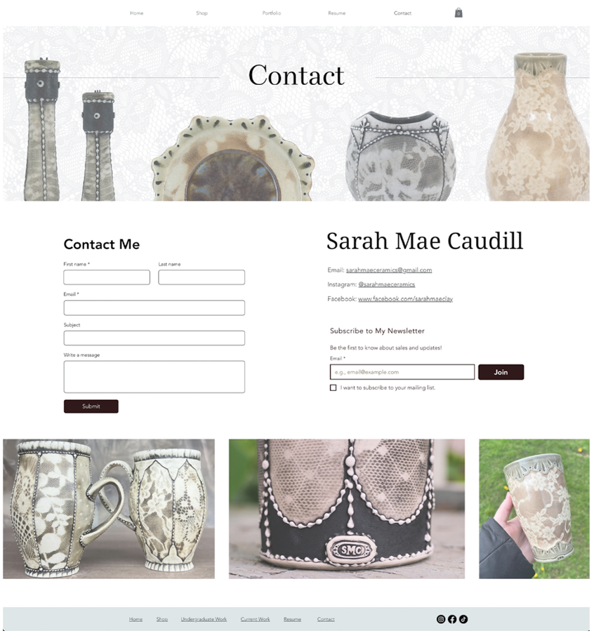
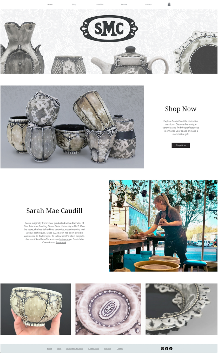
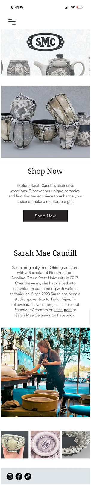
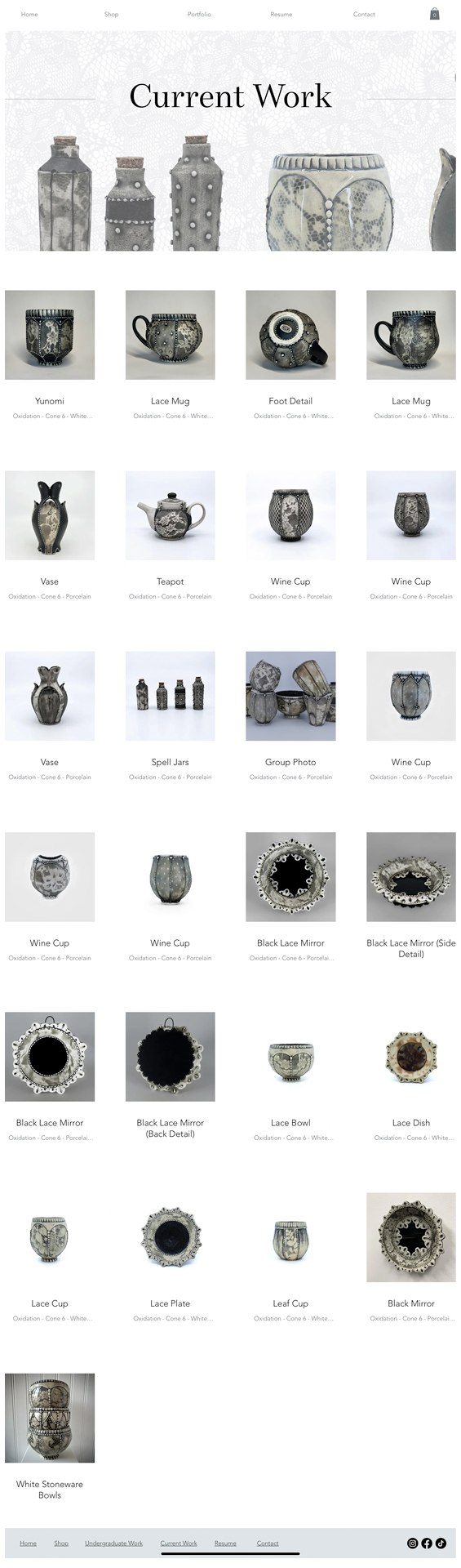
Website
Sarah’s website showcases her work with striking banners that highlight her pieces on every page. The clean design features sharp corners, structured grids, and a soft, minimalist format, creating a modern backdrop for her ceramics. Built to be fully responsive, the site offers a seamless browsing experience across all devices and screen sizes.